Improving job discovery and application experience

Overview
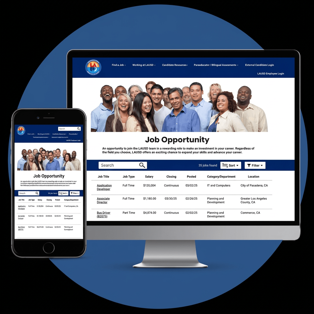
The Los Angeles Unified School District (LAUSD) Careers website serves thousands of prospective employees searching for teaching, administrative, and support staff positions. While the platform provides extensive job opportunities, its complex navigation and inconsistent information hierarchy create unnecessary friction throughout the application process.
This project focused on evaluating the existing user experience, identifying usability issues through research, and designing a more intuitive, accessible, and efficient recruitment experience.

Project Details
Role:
UX Designer & UX Researcher
Platform:
Responsive Website
Methods:
- Heuristic Evaluation
- Usability Testing
- User Research
- Information Architecture
- Wireframing
- Prototyping
Tools
- Figma
- Google Forms
- Adobe Illustrator

The Challenge
Applying for a job should be straightforward, yet users encountered numerous obstacles while searching for positions and completing applications.
The existing experience made it difficult to:
- Locate relevant job openings
- Compare positions efficiently
- Understand salary and employment information
- Navigate between login and application steps
- Complete lengthy application forms without confusion
These usability issues increased cognitive load and interrupted the overall application experience.

Goal
Redesign the LAUSD Careers experience to create a recruitment platform that is:
- Easy to navigate
- Accessible to a diverse audience
- Efficient for job seekers
- Transparent throughout the hiring process
- Consistent across all major workflows

Research
Research Objectives
The research focused on understanding how users searched for jobs, where they experienced confusion, and which parts of the application process created the most friction.
The primary objectives were to:
- Identify usability barriers
- Evaluate the site’s information architecture
- Understand user expectations
- Measure task success and completion
- Prioritize opportunities for improvement
Research Methods
📋 Survey
👥 Usability Testing
🔍 Heuristic Evaluation
🗺 User Flow Analysis

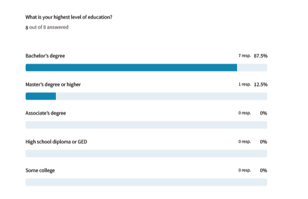
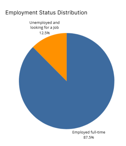
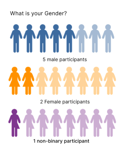
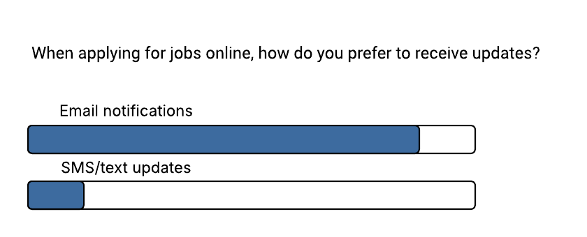
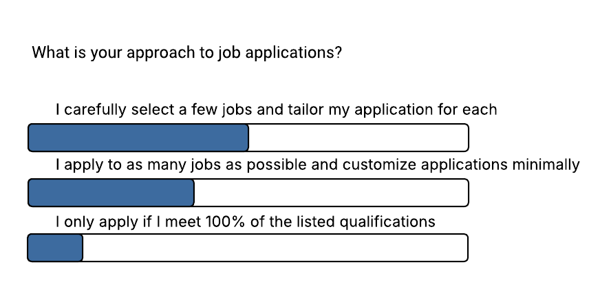
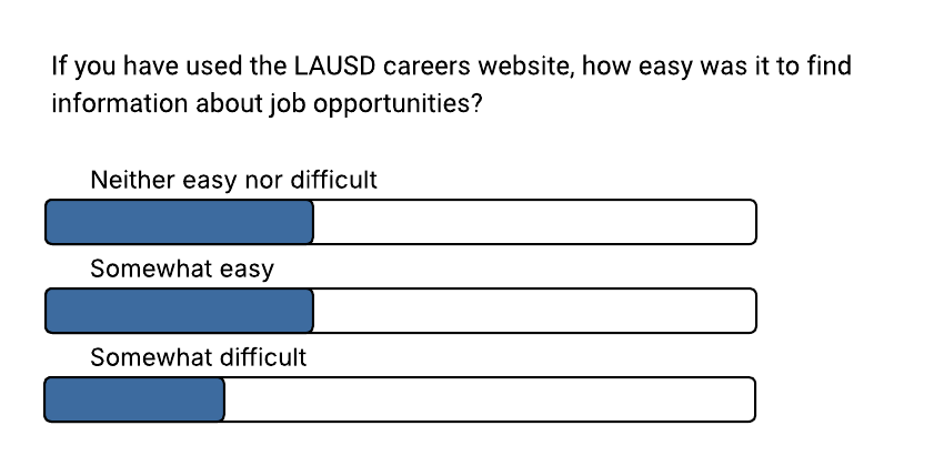
Survey Results
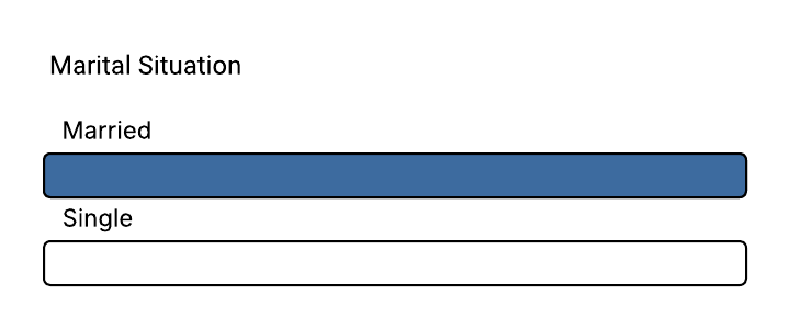
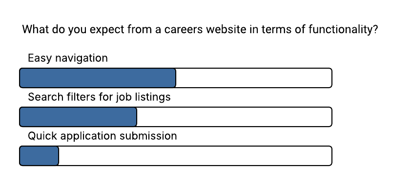
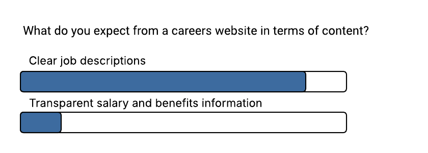
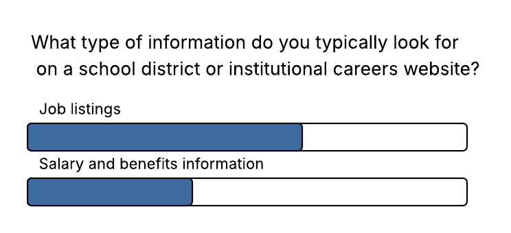
I surveyed participants about their job-search experience to understand common behaviors, expectations, and frustrations before beginning the redesign.

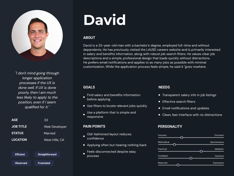
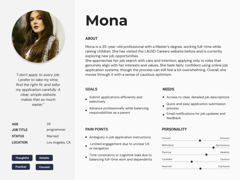
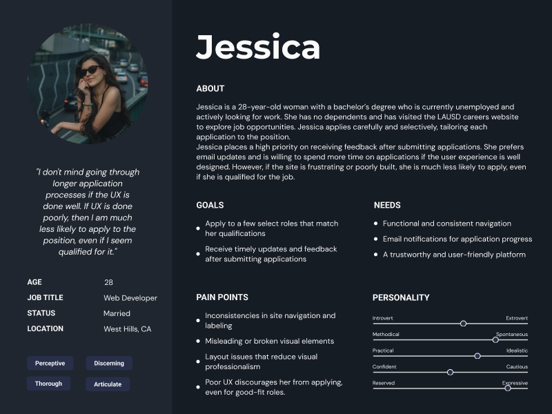
Personas

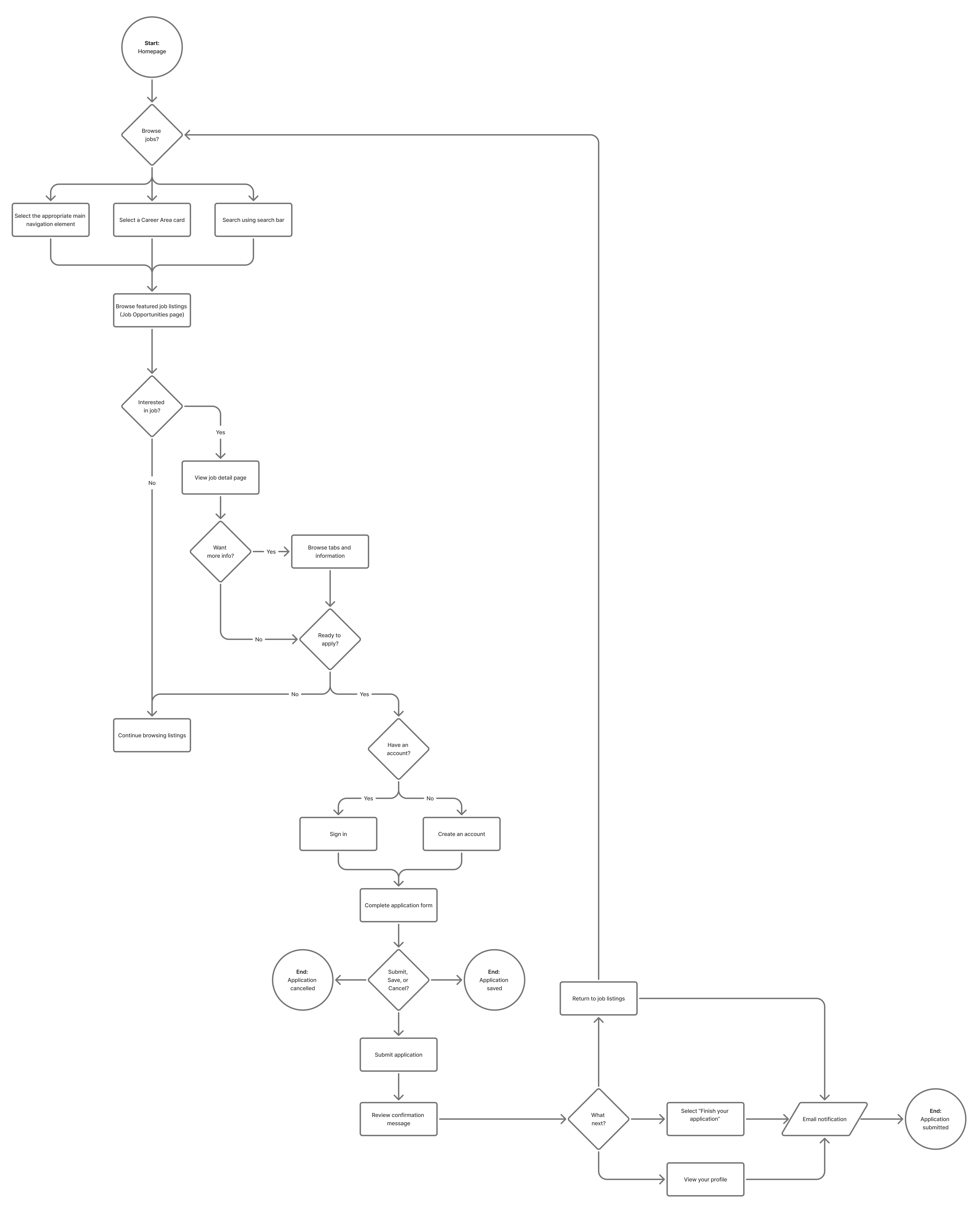
User’s Flow Diagram

Key Findings
Research revealed several recurring usability issues.
Users struggled to locate available positions.
Job opportunities were buried beneath secondary content, forcing users to spend unnecessary time locating relevant openings.
Search and filtering were limited.
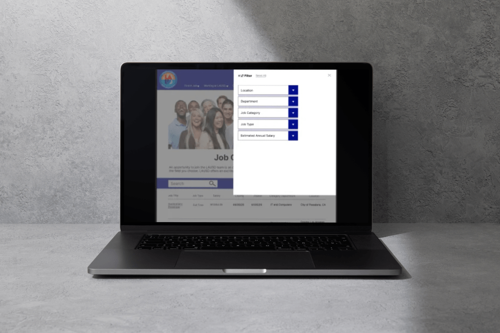
The absence of effective filtering required users to manually browse long lists of jobs, increasing frustration and reducing efficiency.
Important information lacked visibility.
Salary, employment type, and location were hidden until later stages of the process, making it difficult for applicants to compare opportunities.
Navigation created confusion.
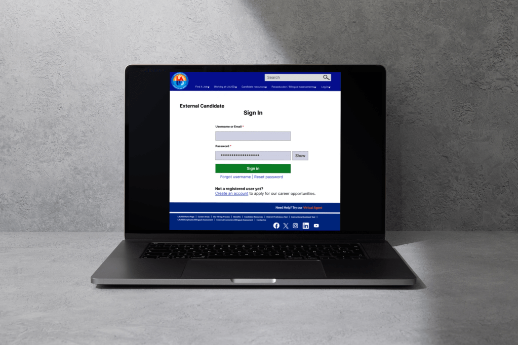
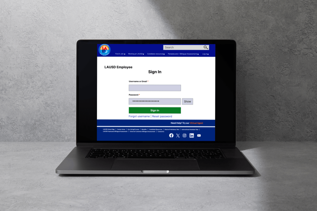
Separate login pathways and inconsistent terminology made it difficult for users to understand where to begin their application.
The application process felt overwhelming.
Long forms presented excessive information at once without adequate progress indicators or visual organization.

Design Strategy
The redesign focused on reducing cognitive load while improving discoverability and accessibility.
The design principles guiding every decision were:
- Efficiency
- Simplicity
- Clarity
- Accessibility
- Consistency

Design Solutions
Simplified Navigation
The navigation structure was reorganized to prioritize the actions users perform most frequently.
Changes included:
- Clearer menu organization
- Improved labeling
- Consolidated login options
- Faster access to job listings
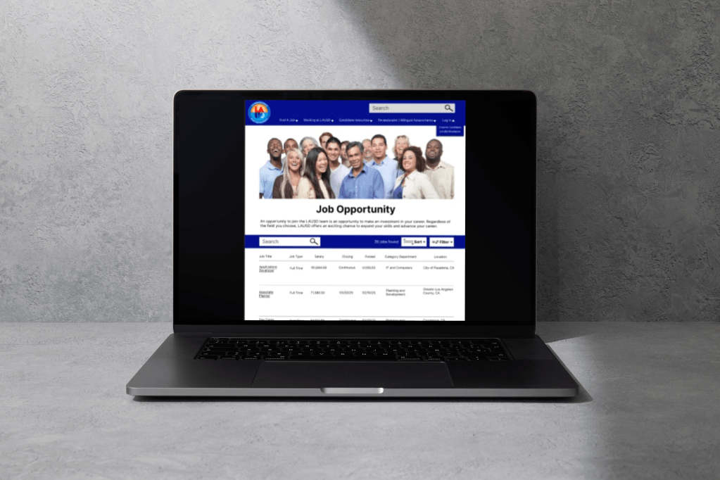
Improved Job Discovery
Finding relevant opportunities became significantly easier through:
- Global search functionality
- Advanced filtering
- Improved job categorization
- Better visual hierarchy
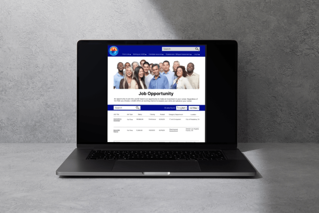
Enhanced Job Listings
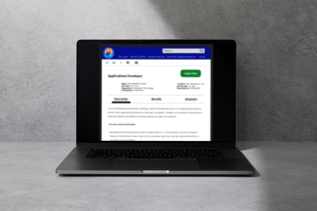
Each job listing now displays essential information immediately, including:
- Salary
- Employment type
- Location
- Department
Users no longer need to open multiple listings simply to compare opportunities.
Streamlined Application Process
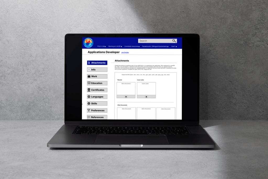
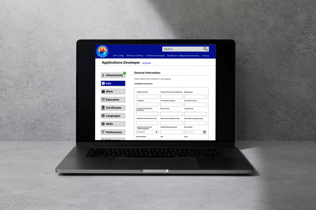
The application experience was redesigned into a guided multi-step workflow.
Improvements include:
- Progress indicators
- Clearly defined sections
- Larger call-to-action buttons
- Improved visual hierarchy
- Better accessibility
Accessibility Improvements
Accessibility was considered throughout the redesign by:
- Increasing color contrast
- Improving typography hierarchy
- Creating larger interactive elements
- Reducing visual clutter
- Supporting easier scanning of information

Design Process
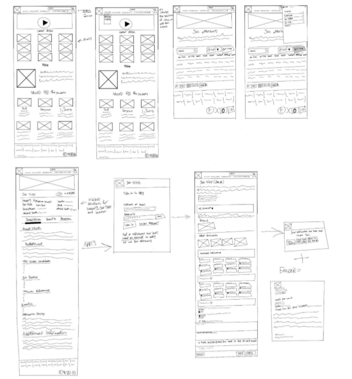
Low-Fidelity Wireframes
High-Fidelity Wireframes

Interactive Prototype
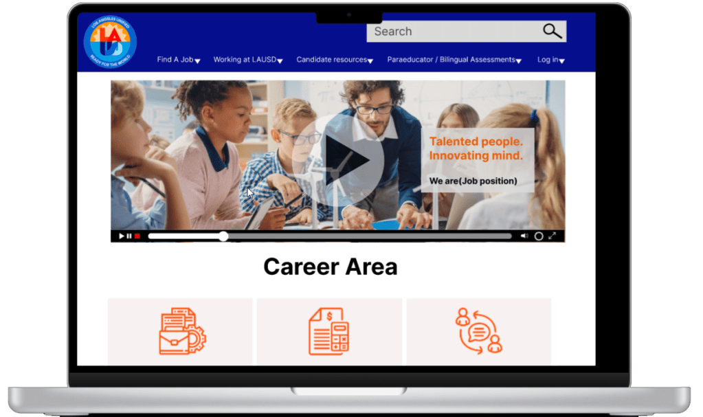
Impact
The redesigned experience creates a more intuitive hiring platform by reducing unnecessary complexity throughout the recruitment journey.
The proposed improvements help users:
- Discover jobs faster
- Compare opportunities more efficiently
- Understand application requirements earlier
- Complete applications with greater confidence
- Navigate the platform with fewer errors


Leave a Reply